.jpg)
Published March 18, 2019 | Updated August 14, 2024 | 5 minute read
Software has opinions. It has opinions about how humans think, how they currently interact, and how they should interact. In that sense, code is just like any prose; yet software has a much more profound ability to guide behavior of its users through its design choices and default settings.
At August, we work to transition organizations from closed, siloed machines into open, learning, human-focused ecosystems that are intentionally designed for the information age. One element of this transition involves scaling use of modern communication and collaboration tools: these tools act as catalysts and enablers for the seismic shifts in working mindsets that form the core of our work. Software’s relationship with the culture and working mindsets of an organization is reciprocal. A new tool won’t be a silver bullet for deep-rooted cultural issues unless we can also shift mindsets. Similarly, even the most forward-thinking cultures will be limited by access to the wrong tools.
Two key elements of agile transformation projects can be enhanced or undermined by the software used:
- The first is the transition from teams grouped by function to teams organized around short-term strategic goals;
- The second is to encourage making information transparent wherever possible.
(It’s interesting to note that in both of these instances we are asking our clients to try to counteract their own human nature: human societies have always been built around hierarchical power structures and small tribes with shared experiences; likewise we’ve evolved to keep information closed lest a competing tribe of hunter-gatherers finds our watering hole.)
In Microsoft O365, there are three choices in the UX design which undermine the tool’s collective ability to support the two elements above. These UX elements are so small as to be almost unnoticeable. To some users, they may actually appear to be intuitive features, rather than bugs. However, they are indicative of opinions that the designers held in the design of the software; opinions that counteract the larger purpose of the tool suite as an enabler for modern ways of working.
Flaw 1: Defaulting to Private
When you create a new Microsoft Team, the UI design guides you to make it “Private”. This means that unless you’re invited to join, you can’t access the information in that Team.
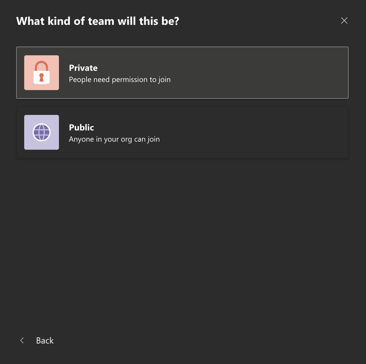
If you’re creating a Private team, you must be in a position to predict exactly who will want to read or be aware of the information contained within. Because nobody can predict the future, this is impossible. As a result, the Team becomes not much better than a lengthy email chain – a closed loop where information (files and conversation) are only available to those in the chain, and must be pushed to anyone else. This is also undermines the ability of matrixed team’s ability to make effective decisions, avoid duplicative work or understand the work of other teams. Finally, this creates additional work for the Team Admin, positioning them as a gatekeeper for invites and access.
A McKinsey study showed that the average worker spends 18% of their time at work looking for information that they need to do their job. In the context of a working week, that’s Monday. By making information readily available through radical transparency, we can reduce this time to near-zero. In many cases, it’s not safe to share information broadly (personnel, legal, finance, etc.), but in most cases, it’s essential to a high-velocity responsive adaptation. The firms that will survive and thrive in the 21st Century will default to transparent sharing of information.
Flaw 2: The existing operating model gets mapped to the new tool
There is no guidance on the right purpose or criteria for creating a new Team.
There’s a wider issue with how Teams are created which isn’t based in active UX decision, but an omission. Some context: In a VUCA world, it only makes sense to organize teams around the work to be done - that is, the strategic goals. By focusing first on the work, identifying the roles needed to complete that week and assembling cross-functional lean teams (with explicit decision rights and stakeholders) around those missions we go a long way to forming a network of Agile teams. To an extent, Microsoft Teams becomes the org chart, where digital Teams are spun up at the same time as their in-real-life counterparts.
In my experience, without explicit guidance, new Microsoft Teams users default to recreating the organization’s “people teams” within Microsoft Teams. This is understandable in legacy organizations, as a result of the dominant historical mental conception of organizing around functions. I’ve seen clients communicate conflicting (or zero) advice, governance or best practices around how Teams are created. As a result, conversations about the work end up in private “Chat” conversations with only “necessary” participants, instead of being held in open transparent channels.
If Microsoft were committed to true agility, there might be a tooltip, help box or any kind of explicit guidance for circumstances under which Teams are created.
Flaw 3: Encouraging opacity
In Planner, there is a checkmark on each card (visible on hover) that, when clicked, immediately buries the card in a hidden section at the bottom of the common. The mouseover tooltip reads “Complete Task”.

Seems like a good feature at first glance, right? Mark it done in one click! No dragging cards! No need to open them up to update!
Consider however, that Microsoft have deliberately added complexity to the Kanban system, and thus made it less user-friendly. Kanban’s beauty is its remarkable simplicity: with just a few columns and cards, teams can see the flow of work from request to completion. In Microsoft’s system, completed items disappear, and the transparency disappears with it. It’s often unclear how a checked task’s status differs from the rest of the tasks in the column - did the team decide not to do that? Is it a duplicate? Is it done? The UI encourages using the tick for any one of these eventuality. Even with a small slip of the mouse it’s remarkable easy to obscure an action and have to go digging for it.
This is smaller, almost imperceptible and is actually a mistake in an active design decision that is indicative of the ways in which Planner purposefully makes information harder to find, not easier.
There is no perfect tool, and Microsoft O365 does have a lot going for it. None of these flaws make Microsoft O365 worse than email (from a functional perspective). I think the real heart of the issue may not be solved through design elements, but through time; at the moment, we’re still trying to apply new tools to old problems. As Ben Evans explains it:
“[A new tool] can't be used to solve the problem in the old way, so 'it doesn't work', and proposes a new way, and so 'no-one will want that'. This is how generational shifts work - first you try to force the new tool to fit the old workflow, and then the new tool creates a new workflow. Both parts are painful and full of denial, but the new model is ultimately much better than the old.”
We are in the midst of figuring out the new model, the new workflow of the future. Adoption of new communication tools accelerates that learning, and the uncomfortable space we find ourselves in is an inevitable part of any uncertainty journey.